Neglecting mobile devices in your conversion strategy would be foolish. Trends show that mobile devices are becoming more and more popular. You think that’s an old hat? You wouldn’t believe how many don’t take it to heart yet.
But no problem, here are 7 simple tips to improve mobile conversion.
Mobile is an important channel for those who
- offer products and services
- want to connect with the company.
Research shows that 70% of B2C users consume mobile media and 79% use social media on mobile devices. As more and more people use mobile devices instead of desktops, it is essential for companies to make their marketing strategy future-proof by increasing mobile conversion rates.
What is mobile conversion rate optimization?
The mobile conversion rate is the percentage of users who read and consume media & products on mobile devices. The higher this percentage, the more successful is the mobile marketing strategy.
Optimizing the mobile conversion rate means apllying strategies aimed at increasing the percentage of converting users.
The following 7 tips will guide you through proven techniques to increase the conversion rate for mobile devices. All for the sole purpose of helping your mobile audience get better value, increase lead generation, and increase sales.
1. Accelerate your mobile website
If there is one golden rule to improve the mobile conversion rate, it is speed. Page speed is the essential component of accessibility on the road or at home. Besides Google’s long-standing focus on improving the speed of mobile sites, there is some irrefutable evidence based on web analytics data.
On the basis of numerous own sightings and analyses, I could determine that more than 60% of the users leave websites, which require more than three seconds to load.
Every second or millisecond is crucial.
Tip: In Google Analytics, you’ll find “Access via mobile phones & tablets” under “All website data – Behavior – Overview”. Add a segment for “Access via mobile phones & tablets”. In “Behavior”, you can check your website’s average page speed.
There you will find detailed page speed recommendations for each URL. These include, for example:
- Minimizing the number of http requests
- JavaScript files & response time
- CSS stylesheets & sprites usage (size & minifying)
- More efficient browser caching
- Large images (high resolutions)
By the way, you will find exactly the same elements in XOVI. Exactly such OnSite misalignments can now be corrected using the two tools mentioned above.
How do you make sure that the website loads as fast as possible?
That’s how it works:
In order to guarantee a fast loading during the initial page impression, you should always use a responsive framework designed for mobile devices.
Good examples of a framework are:
Foundation
Foundation is a framework that comes with a large number of predefined elements. In addition to individual components, there are completely assembled HTML templates, blocks or UI kits. In addition to the possibility to customize elements with attributes, Mobile-First- and Responsive Design are also on board. Foundation is ideal for beginners with little programming experience or for a project start with fast progress.
Bootstrap
The framework Bootstrap was developed by Twitter and is well known and popular among developers.
Semantic UI
Semantic is comparable to bootstrap. In addition to a large selection (50 elements, 3000 variables) of elements, it also stands out for its ease of use.
Milligram
Milligram is indeed a very minimalistic framework which is limited to crucial components. This allows simple yet beautiful designs. The focus here is especially page speed.
Further possibilities to improve the page speed are:
Installing a caching plugin or using CM systems including caching capabilities.
Example WordPress
WordPress itself needs a plugin to migrate a reasonable cache. Here are a few very useful plugins:
- W3 Total Cache
- WP Super Cache
- WP Fastest Cache
- Cachify
If you want to use other CM systems, you might want to consider Contao. Contao is not as widespread as WordPress, but is Made in Germany. It was developed some time ago by Leo Feyer from Wuppertal. For some years now it is Open Source and has been further developed by a small community in the Git. A cache system is already included in this system, which can be adjusted individually.
2. Improve your website design
 The first impression counts. That’ s why it is important to shape the design of the mobile website. The first impression takes place in the lymbic system (part of the brain) and transmits within a very short time the appeal or relevance of the site. In a fraction of a second, the user decides whether the design is appealing and whether or not all the information is available that is important for stimulating the purchase.
Various research results even support the hypothesis that good design creates trust and encourages visitors to research topics on your site or to buy – i.e. actually to scroll or “tap”. Bad design, on the other hand, does not have this effect. It is important to focus on a user-friendly design, so that the visitor finds the necessary information easily.
Examples of the solution:
Use responsive web design. Pay attention to user flow. Ensure that mobile visitors find the right information and encourage the user to buy the product.
By the way, it doesn’t make sense to have a website optimized for mobile if your marketing campaigns aren’t optimized as well. If the campaign ruins the surfing experience for mobile visitors, they will simply walk away and not return to the site.
3. Use appealing imagery
Not only do images attract attention, they can also help establish a connection to the visitor.
Using Overheat (a mousetracking tool), I discovered that content featuring images increases time on site as well as the interaction rate, in comparison to pages without pictures.
Appealing images are:
- Pictures of people, because we are used to looking at others.
- High quality images that evoke emotions, i.e. images that match the service emotionally.
- High-quality product images so visitors know what they are buying
Please keep in mind: The higher the image quality, the larger the original image. That’s why it makes sense to compress and scale images so that they load quickly onto your website and don’t slow down page speed. Almost all image formats such as jpg, png or gif are suitable. The PNG24 image format has the highest quality compared ti image size. PNG files can be reduced relatively easily! Simply use tinypng.com to upload and compress files using Drag’n’Drop.
4. Easy usability
Usability is an important part of every interaction on a website. According to Jakob Nielsen, a recognized expert in the field, usability includes the following aspects:
- Make is as esay as possible for users to complete new tasks when they arrive on your website (e.g. searching for information or adding an article to their wish list).
- Ensure that the process of completing any navigation or conversion is efficient.
- Ensure that all content and products are easily accessible to returning customers who didn’t complete their purchase.
Tip on the topic:
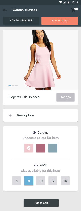
- Mark/highlight selected items in an e-commerce store.
- To avoid frustration, design forms so that users have enough space to type a query.
- Ensure that a Call-to-Action (CTA) is easily accessible.
5. Implement automatic completion
 If you help customers in spe to find what they are looking for, they are more likely to convert.
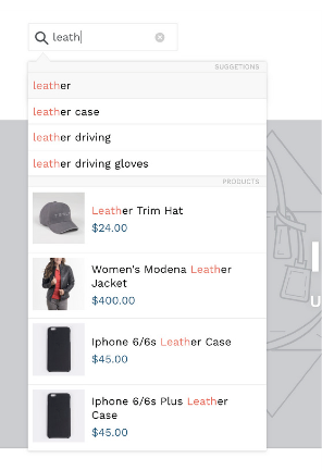
A sensible approach is to use auto-completion / auto-suggest (like Google) as part of the on-site search function.
Present users with available options while they are typing. Make sure they and can easily and quickly select an item from the list. Auto-completion reduces the time spent on searching and has a positive effect on user experience. When using Shopify or WooCommerce, you can easily implement automatic completion using a plugin or Shopify app. Another option is to use on-site filtering similar to Amazon. This helps users to get more and more relevant elements with each selection, and relevance is known to improve conversions.
6. Use product videos
Getting the visitor’s attention Above the Fold is the first step towards winning conversions.
By using content pieces (overheat function) such as videos, time on site on landing pages (mobile and non-mobile) increased measurably. It can therefore be assumed that the consumer would rather watch a video than read a long text about a product. In addition, the videos significantly increase conversion.
7. Build trust
When people trust you, they’re more likely to convert. But how can you build trust for mobile users?
In many cases, you use some of the same techniques that apply to the desktop browser:
- Social proof (e.g. testimonials and reviews) can convince potential customers.
- Show that sensible personal data is well protected and in good hands.
- Provide company information that shows that you are a real company.
- However, there is still something blatantly important that can be done especially for mobile users: Add a call now button to your mobile website.

