A quick glance at Google’s company philosophy tells you all you need to know. Number 1 – “Focus on the user and all else will follow.” (https://www.google.com/intl/en/about/company/philosophy/) The following tips for improving user search experience surrounding your website should therefore only be used if you know that users will respond positively to them – users differ from domain to domain, so they’re not set in stone. Let’s get started:
Tip 1: Facilitate easy navigation to relevant sections
Divide up your content up with sensible, relevant sub-titles (they’re usually pretty self-explanatory) listed in a table contents visible in the user’s first viewport. Particularly on longer pages, it could be the case that a wide range of different topics and areas appear on the same page or article – so save your users the hassle of scrolling down the page to find the section they’re most interested in! Not only does a contents table provide an overview of the information contained on a page, it also enables users to navigate directly to the most relevant item.
But, I hear you say, this will reduce the user’s time spent on the page. True, but that’s preferable to users who head straight back to the SERPs having felt completely overwhelmed. What’s more, users who first of all have access to a clear, structured table of contents are better able to prepare themselves to engage with the content on a page. The best-known example is, of course, Wikipedia.
Tip 2: Content equality with tab and toggle elements
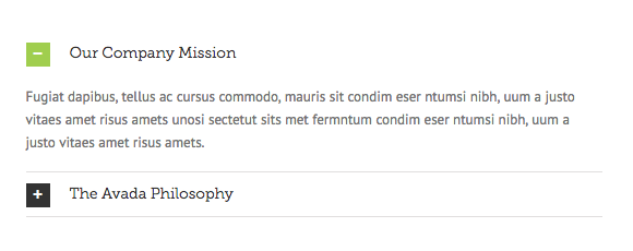
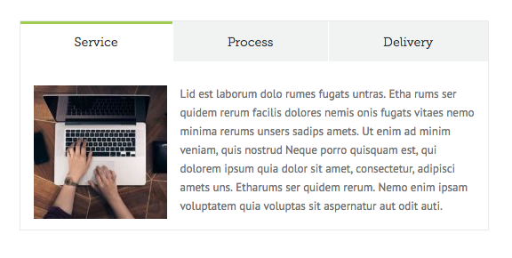
If you want to shorten your text or give it a more user-friendly layout, consider using simple web layout tools such as tabs and toggles to blend content in and out. Such elements are particularly useful when it comes to various pieces of text which have equal worth but can’t all be displayed simultaneously due to lack of space. Tabs and toggles allow them all to displayed within the same viewport.
A word of warning, though. Content which is hidden behind tab and toggle elements is treated as secondary by Google so make sure your most important keywords appear in the introduction or in the first section of text too. Use tabs and toggles carefully when dealing with particularly SEO-sensitive content.


Tip 3: Enrich your content whilst keeping it short and snappy
If your text contains complex or specialist terms, or if certain phrases require a bit more explanation, tool tips, hover boxes and modal frames are your friends!

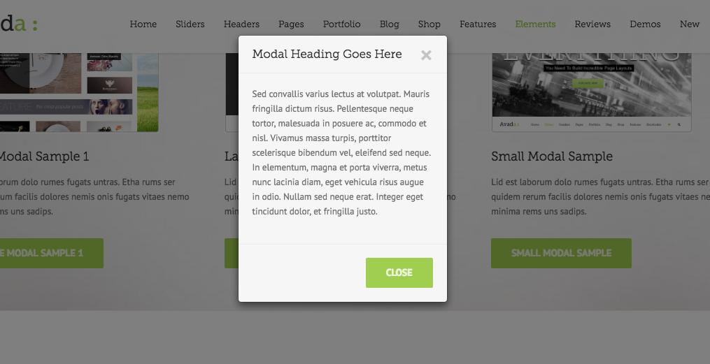
Whilst tool tips are useful for short pieces of additional info (e.g., acronyms, foreign words, specialist terms), modal frames allow you to insert an entire text without the user having to leave the page. Users access these texts by hovering over content to access information which will enrich their understanding of the primary content. Repetitive back and forward clicking becomes a thing of the past.

What’s more:
Modal frames don’t just enable you to expand your text, but can also be used to remove less important text from view and hide it behind a modal frame, thus shortening the primary text. But again, be careful how you go about prioritizing your content and also make sure that the “hidden” content is recognizable for the user! Commonly understood signposts include a small “i” for additional information or a “+” to “find out more.” As explained in tip 2, don’t forget that Google treats hidden, modal content as secondary, so plan your SEO accordingly.
My recommendation:
- Bits & bobs: Tool tip
- Teaser texts: Advanced tool tip or hover box
- Entire texts/images/videos: Modal frame
Tip 4: Sensible link placement. Buttons, hyperlinks & tabs
If you have a link which leads into a conversion funnel or delves “deeper” into a topic, make sure it opens within the same tab – the user has already made a decision to continue to the next step so you don’t need to worry about them leaving the primary content behind. CTAs (Calls to action) in the form of buttons like “Buy now,” “Read more” and “Next” are good examples.

But if a link only leads to a related topic (or if it’s an external link), it’s ok to have it open in a new tab. The user is then able to consume the additional information, or briefly visit the external link, but your primary content will remain open.
There’s one thing however which, in my opinion, webmasters should not do – and that it placing links with key anchor texts on landing pages just to boost their internal link structure. As with your own external links, the classic rule applies: only clicked links are truly valuable links – regardless of what you might think about link juice. For users, every new page they have to open is considered tiresome (see: Lazy User Model), especially when it doesn’t lead them directly to their ultimate destination. Google is also able to pick up on negative user experience, which means it’s more important than ever to reduce the number of newly opening pages and tabs by using hover boxes and modal frames, as explained in tip 2. Summary: the user comes first when it comes to links too, so be careful how you place them.
Tip 5: Boost visitor interaction with simple survey tools
Surveys are a great way to get users to interact with your page whilst simultaneously finding out more about the interests and expectations of your target audience. Gamification, curiosity and desire to share are only some of the psychological effects instigated by surveys. My tip: ask questions to illicit answers which don’t just interest you but also your target audience. Once you have concluded your survey, don’t forget to display the results to users.
My favourite surveys: Wedgie pools (simple), engagement form (more complex), plus various WordPress plugins.
Tip 6: Enable comments and other user interactions
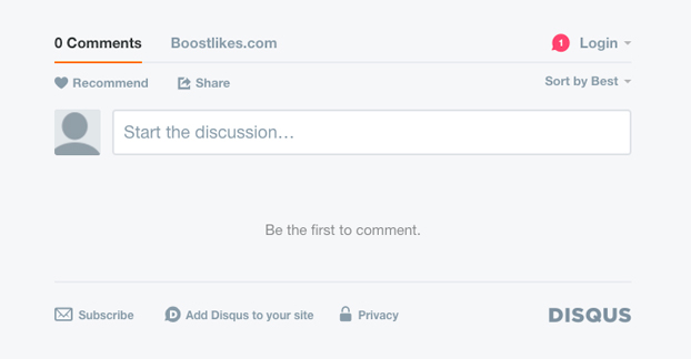
As with surveys, comment sections give users the opportunity to engage with your page/brand/business, only this time they can choose the subject themselves. An email link is usually too time consuming for most users who find a simple comments box with answer notification must more accessible. Comments sections also enable users to interact with each other, answer questions among themselves or simply hear the opinions of others.
A nice side effect: users are likely to use and repeat important keywords whilst the page’s content, depending on interaction rate, is continually updated. Current content is a definitely a positive ranking signal!
Of course, it’s also important to moderate comments appropriately and also to respond to questions. Choose articles carefully, too. It’s up to you whether you offer a simple tool for better user experience or whether you open up a Pandora’s Box of questions and issues. You can always turn the function off it things get out of control but don’t put people off!
My favourite comments tools: Facebook comments & DISQUS (also used by XOVI). Which do you prefer? Comments welcome!


Tip 7: Use different media formats to engage your users
Here’s how I look at it: the more varied the media on your page (images, infographics, podcasts, presentations, video, etc), the more scope the user has to choose which format suits him/her best.
The presentation tool “Slideshare” is particularly useful when it comes to products or services which require additional explanations. Simply upload your informative presentation and embed it on your website. And the best bit: unlike with videos, the user decides the speed at which they consume the content! There’s also no need for headphones or a quiet environment since the presentation doesn’t have to include sound, and the presentation can be easily downloaded and shared for later consumption. This makes it my favourite interactive tool, especially in B2B.
On the other hand, if the product or service needs to be seen in action, there’s no doubt that video is a preferable format. It can also be much more personal since videos usually feature a person or at least a human voice. Depending on your brand personality, a video can sometimes be a better option.
Did you know? You don’t have to have created a presentation or video yourself in order to embed it on your website. Depending on your field/product, don’t be scared to upload existing material – of course with appropriate credit.
To sum up…
As a copywriter, author or webmaster, you should be aware of common UX elements before composing your text – this enables you to structure your content accordingly. Dealing with UX later is possible but much more complicated and time-consuming. You also run the risk of overloading your page with UX elements for which your content simply isn’t suited!
My advice: Make a note of available (and sensible) UX options for your content and work closely with your copywriter. Your next top-10 ranking won’t be far away!
Hopefully, this article has included a few useful tips which you can apply to your online marketing to improve user and search experience. Good luck and don’t forget to add your own UX tips in the comments section!
 English

