Presentation of the Sidebar
Definition of the Sidebar:
“Sidebar” refers to the vertical area next to the main content of a website, usually equipped with “additional information” and/or “links” to other areas of the page.
Here are two examples:
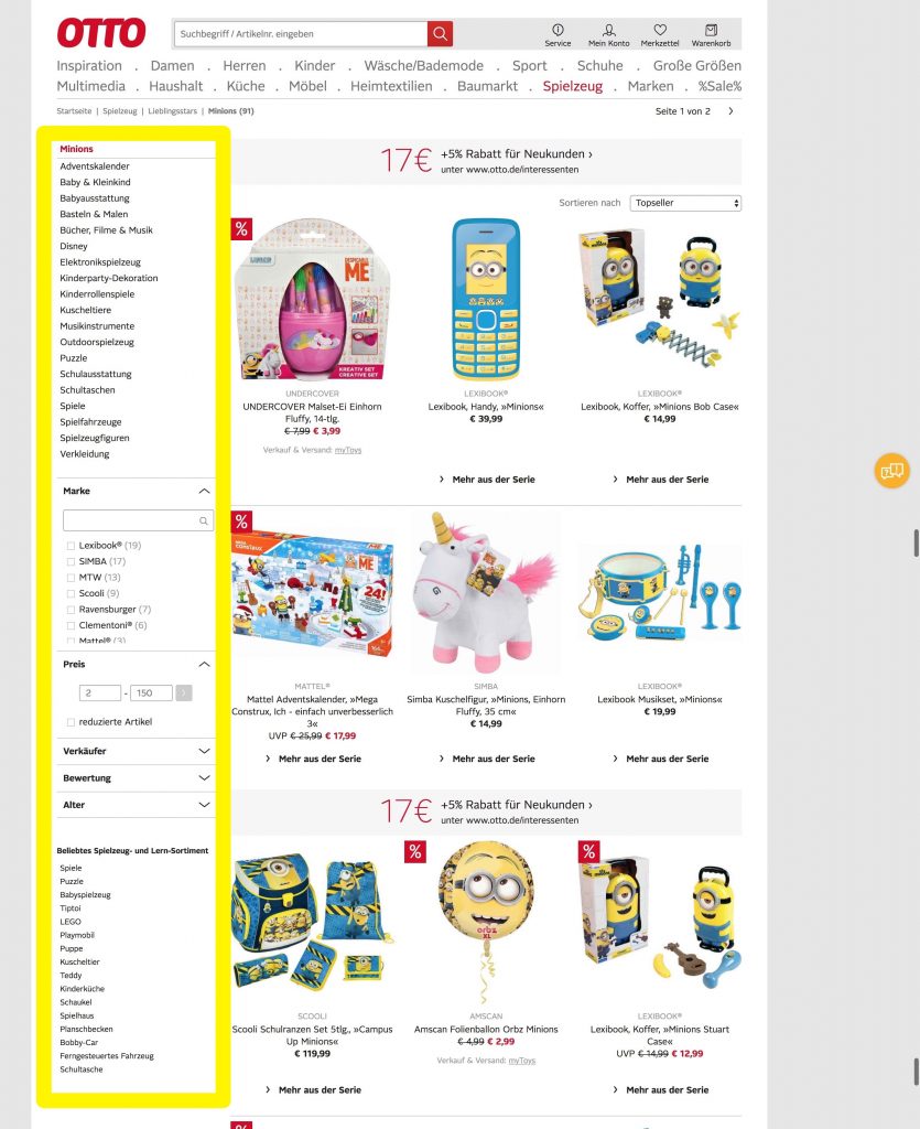
Left Sidebar:
Typically, the left sidebar is used as an additional navigation element next to the header navigation. Since we read from left to right in the western culture, the left positioning helps especially with the orientation on the website and gives the user the possibility for deeper navigation.
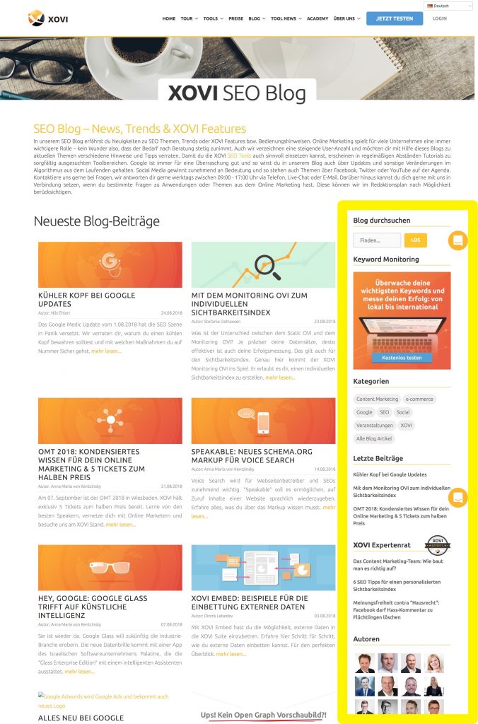
Right Sidebar:
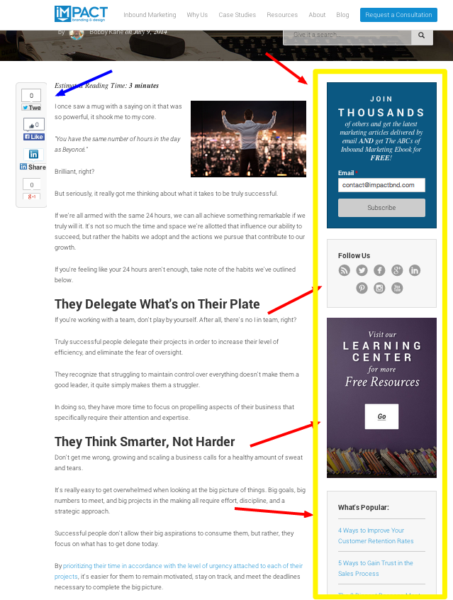
For exactly the same reason, the right sidebar is usually equipped with additional information. Due to the reading direction, it is not noticed by the user until later and no longer serves to navigate to a specific destination, but rather offers offers to “see more”, “linger” and “explore”.
The left sidebar is particularly often used in eCommerce, since categories often have to be displayed within a tab, which usually cannot be displayed via header navigation. On websites with a “simple header navigation”, the sidebar is therefore essential for the user to reach his destination as quickly as possible.
Therefore, the left sidebar should not be part of the discourse today. In this article I would like to deal exclusively with the right sidebar, since the topics “Sidebar as a navigation element” and “Placement of filters in eCommerce” would go beyond the scope of the article.
Which Goals can be pursued with a Sidebar?
- Increase of brand awareness and company image (branding)
- Generation of fans and followers in social networks (Social Follow)
- Direct monetization through advertisements (ads)
- Structure of e-mail subscribers (newsletter signups)
- Reduction of bounce rate (SEO)
- Increase in the length of stay and number of pages a visitor views (SEO)
- Sale of products (conversions)
- Mapping of information that promises added value to the user (UX, SEO)
- Highlighting of important content that might otherwise have been overlooked (UX, SEO)
- Improved navigation within the blog – by displaying single articles, categories, search bar, etc. (UX, SEO)
and much more
If you read the bulletpoints carefully, there should be no doubt that the Sidebar has definitely earned its place on the web and can be extremely useful for both website operators and users. So why do many websites turn their backs on the Sidebar? Why should you part with a Sidebar in all its positive aspects?
Different Opinions on the Web
Fortunately, I am not the first marketer to ask myself how a sidebar should be structured and whether a sidebar is still useful today. Below are some expert opinions and tests, each with a comment from me at the end.
#1 Sidebar Opponent: VideoFruit
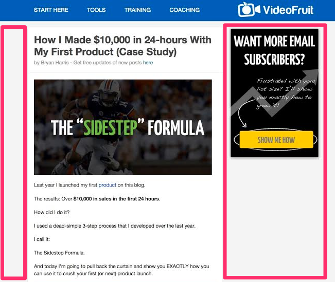
Question: “What would happen if you removed the sidebar and instead focused the user’s attention 100% on the content? – Bryan Harris of VideoFruit. asked himself this question.
Hypothesis: The reason for his question was the frustratingly low click rate of just 0.3% on the blog sidebar. “The removal of the sidebar leads to the fact that the user is less distracted and therefore reads a larger part up to the end of the articles and follows there the call to action – so his hypothesis.
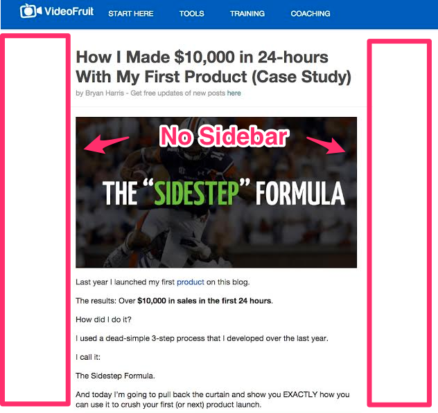
Result: Bryan performed an A/B test to test the hypothesis. The version without sidebar resulted in 26% more newsletter signups. After further tests that confirmed his hypothesis, Videofruit no longer runs a sidebar on the entire website today. Bryan seems to have reached a final opinion here.
Constraints:
The result is clear and speaks for itself. Should we all remove Sidebar from our blogs now? There are a few limitations in his test: Only the conversion rate for newsletter signups was tested.
Bryan didn’t have a “typical” sidebar with a corporate or self-introduction (elevator pitch), links to the most popular articles and his social media profiles, etc.
Strictly speaking, it was not the sidebar as a holistic content element that was compared, but only the CtA position of the newsletter signup. In short: Bryan now knows that it is worth leaving out the sidebar with a Call to Action and placing the Call to Actions within the content.
Read for yourself – Official link to Bryan’s article: Ditch the Sidebar on Your Website and Increase Conversion Rates by 26%
#2.1 Sidebar Opponents: Impact BnD (back in 2014)
Question: John Bonini of ImpactBnD also doubted the effectiveness of his sidebar, but seemed unsure: “I can’t just remove the sidebar, can I? Every blog and guru uses a sidebar on their blog. There’s a good reason for that, isn’t there?”
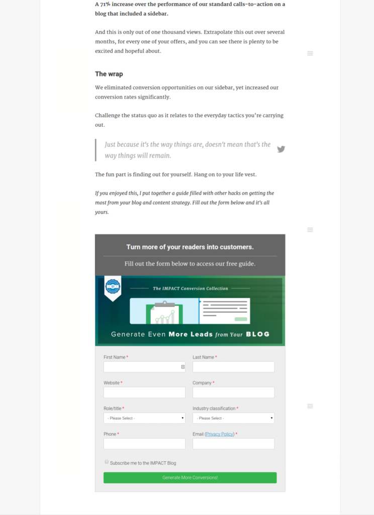
Hypothesis: He knows it better, because it seemed logical to him just like Bryan: “If I reduce the distraction and the background noise, the contents of my article will be read more attentively and Call to Actions will be followed more closely”. He also did a test on his blog, with the difference that he didn’t integrate the Call to Action as a button or banner, but as a direct newsletter signup form.
Read for yourself – Official link to John’s article: How We Removed Our Blog Sidebar and Increased Conversion Rates
The result was a 71% increase in newsletter signups (!)
Comment:
Unlike VideoFruit, ImpactBnD really had a “classic” sidebar in use. One that was really fully exploited and was fully featured next to the content with numerous content elements such as Call to Action, Social Follow, Freebee banners and links to popular articles. By removing the sidebar and using a form directly on the URL to achieve an increase of 71% is really a great result!
Interim Conclusion
If you only consider the metric “Conversions”, the removal of the sidebar definitely seems to increase the conversion. Here you can already draw a first interim conclusion.
If you were to see the sidebar as a pure medium to achieve more conversions, the whole thing would be quite logical. After all, the golden rule of conversion rate optimization is: one page, one goal. If you ask the user to look at more pages, download a freebee, follow the company in the social media and share the URL, the URL no longer has only one clear goal, but quite a lot of different kinds. And this Choice-Overload can lead to a lower conversion rate.
#2.2 Sidebar Proponents: ImpactBnD (today in 2018)
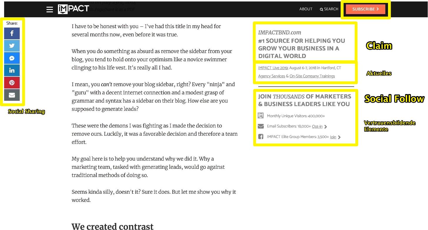
Today ImpactBnD runs a sidebar again, but it is no longer a “classic” sidebar (see below). The new sidebar no longer competes with the content and/or requires different tasks from the user. At least not to the same extent anymore. The new sidebar is very casual and additive. It briefly introduces ImpactBnD with a “claim”, discreetly points out “news” and represents “confidence-building elements” such as the number of newsletter subscribers, the number of website viewers and the number of members of a Facebook group. The signup form was removed from the article and instead integrated into the navigation bar as a clearly visible CtA button.
John’s article: How We Removed Our Blog Sidebar and Increased Conversion Rates
By the way:
The new move of the Newsletter-CtA was a sensible step. There are already several articles and studies that prove that forms should be converted via “Modal” or Button to an extra URL instead of implementing them within the URL, primarily because of the “Multi-Step-Approach”.
- https://www.ventureharbour.com/multi-step-lead-forms-get-300-conversions/
- https://klientboost.com/cro/multi-step-landing-pages/
Which I like well briefly summarized:
- The Call to Action has migrated to the Header
- A company presentation (Elevator-Pitch, Claim) can be found in the Sidebar
- Indicators of Trust are located in the Sidebar
- The sidebar is sticky! It scrolls along and is permanently visible for the user.
Why I like the above-mentioned elements and what added value they mean is explained in more detail below.
#3 Sidebar Proponents: Neil Patel
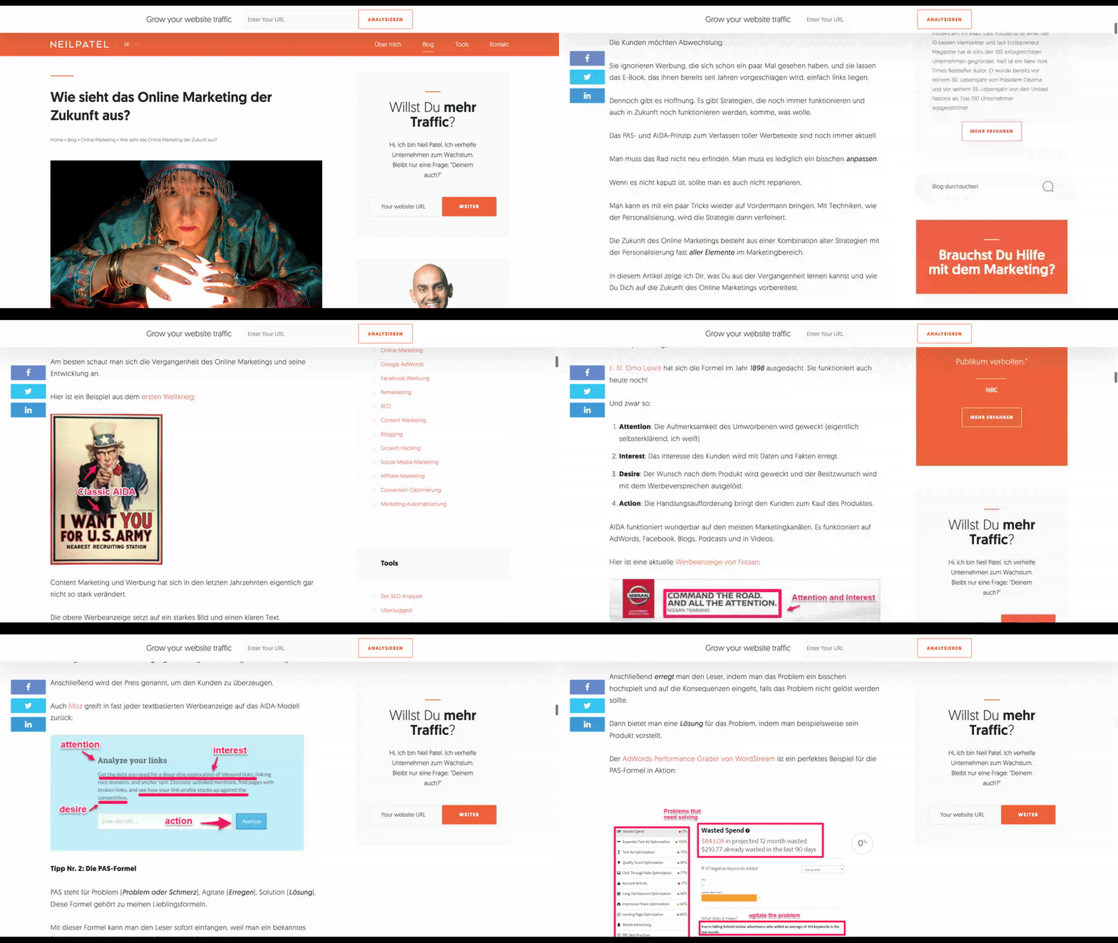
Neil Patel, one of the most successful digital marketers of our time, is a great supporter of the Sidebar. But even Neil Patel doesn’t recommend to use the Sidebar on URLs that have a clear conversion goal. In some directories of his websites he deliberately does not use Sidebar. He thus confirms the result of the two previous experts: If the primary goal is conversions, then the sidebar is omitted.
Nevertheless, he is generally a great supporter of the Blog Sidebar, especially the content elements “biography” and “e-mail opt-in”. For him, building newsletter subscribers is something “casual”, a micro-conversion, while marketing his digital products is a macro-conversion.
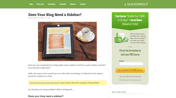
Read for yourself – Official article by Neil: a href=”https://www.quicksprout.com/2015/04/22/does-your-blog-need-a-sidebar/” target=”_blank” rel=”noopener”>Does your Blog need a Sidebar?
Although it’s a test that the top two did, there are some positive aspects to the sidebar:
- Casual brand building (personal connection)
- SEO (Internal Linking), Link-Juice
- Incidental newsletter subscriptions, the emphasis is on incidental
- Presentation of its products
- He sees the goal in reading articles and showing expertise.
So, what’s the purpose of a sidebar? Well, it’s an area you can use to promote products or services as well as to get users to do anything else you want.
I’ve found that including your bio on every page of your blog, within the sidebar, is a great way to connect with your readers. This helps build a loyal community, which is the main reason I have a sidebar.
#4 Sidebar Proponents: Bernard Zitzer
The first two tests and examples have clearly shown that the conversion rate can be optimized by omitting the sidebar. But the examples disregard some important functions of Sidebar. How did the omission of Sidebar affect the bounce rate? Or on the sites/visit? Or on the brand searches? Or on the SEO ranking of the linked URLs? Or on the retention period?
Does every blog reader absolutely want to subscribe to the newsletter or could they have advertised a product? Can’t you have both?
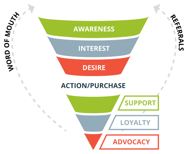
The Sidebar as Content Element along the Conversion Funnel:
Source: https://www.outboundengine.com/blog/5-steps-to-increase-referrals-for-criminal-defense-lawyers/
Conversion-Funnel (AIDARA-Modell)
- Attention
- Interest
- Desire
- Action
- Retention
- Advocation
An important SEO and content marketing rule is: Make the content available in as many media (text, bullet points, infographics, presentation, podcast, video, etc.) as possible, so that the user can decide for himself which medium he prefers at this moment.
In my opinion, the situation is the same with some website elements. Some users get to the website for the first time, so they are at the top of the conversion funnel. It is important to lead them closer to the brand and to build trust with them by showing them expertise and inviting them to stay on the site. Here the newsletter or the social follow is a useful microconversion. And the internal linking also plays its part.
Others are already continuous blog readers and have already subscribed to the newsletter, but have not yet purchased the product. So you are in the middle of the conversion funnel. Here it is important to build trust further and/or ideally to persuade them to buy (macro conversion). A suitable call to action is relevant for this part of the user.
And yet others are already customers (and newsletter subscribers), so they have already gone through the funnel. These have to be kept as customers (retention), perhaps converted to fans (advocation). An up-sell or cross-sell can also be interesting goals.
I don’t mean to say that the sidebar has to fulfill all these functions. However, the website should be able to display these functions holistically and different web design elements are available for this purpose. The sidebar is just one of many.
Alternative elements:
- Header Navigation
- Popups & Modals
- Floating Social Icons
- Verwandte Inhalte (im Content oder unterhalb)
- Footer-Content
- Mid-Page-Call-to-Actions
- Hello Bar
- Browser-Benachrichtigungen
- Engagement-Tools (Chat)
Implementation example along the Conversion-Funnel:
On his official website (Neilpatel.com) you can see very well that NeilPatel doesn’t have just one goal with his sidebar. He makes full use of it and also integrates other elements in order to serve the entire spectrum of his target group accordingly. He also deliberately uses the StickyBar with a Call to Action to keep the conversion rate high despite the full sidebar.
My current preferred sidebar elements:
- Company presentation in the upper range (elevator pitch),
- but not in the Sticky Sidebar.
- Indicators of Trust as an element of the Sticky Sidebar
- Call to Action as an element of the Sticky Sidebar
- Newsletter & Conversion Call to Action (both)
Conclusion
The sidebar is no longer a must. Many people go away from it and allow the user to concentrate more on the content. Formerly a fixed website standard, today you should be able to justify why you want to keep your sidebar. But before you rashly remove Sidebar from your blog, you should make sure that other website elements can capture its function(s). As always in marketing, you need to be aware of your target audience along the conversion funnel in order to make strategic decisions. And as always, testing is the best way to be truly data-driven and therefore secure.
What are your arguments for or against a sidebar? Do you disagree with me? As always, I am looking forward to your comments and suggestions!


